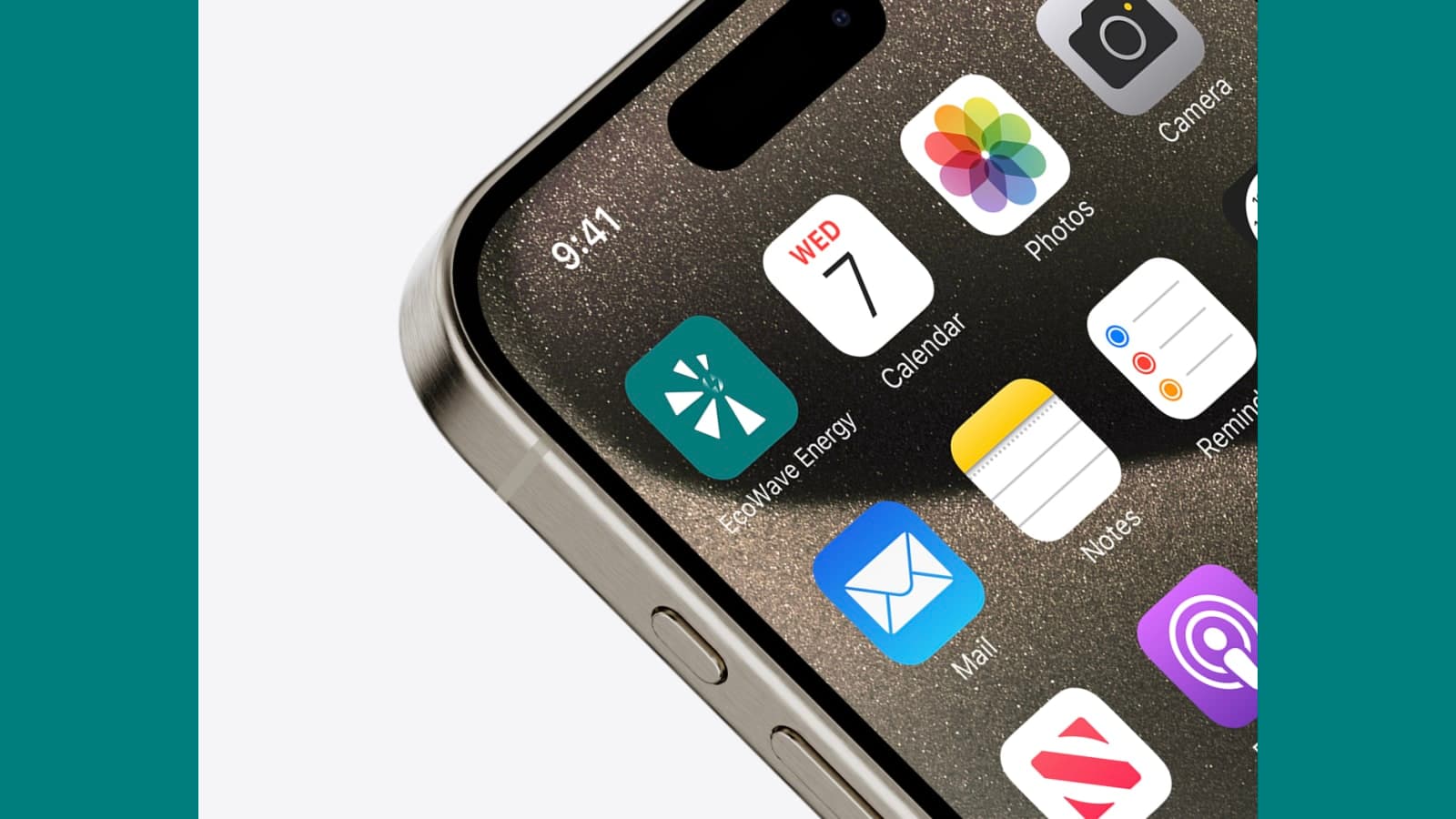
EcoWave Energy
A complete visual identity for a smart-energy brand — sunburst mark, teal-and-solar palette, a full guideline system, and promotional films.
- Brand Identity
- Logo Design
- Brand Guidelines
- Motion Graphics
- Video Editing
The Problem
EcoWave Energy had a strong proposition — smart, sustainable energy that gives homeowners and businesses clearer insight, greater efficiency and full control over their usage — but no visual identity to carry it. To launch credibly in the clean-energy space, the brand needed a complete, consistent system, not just a logo.
Our Approach
We built the identity from the essence out — Insight, Efficiency, Sustainability. A sunburst brandmark with a central energy spark signals clean, renewable power and forward movement; a refined teal wordmark pairs it with trust and clarity. We locked a teal-and-solar-yellow palette, typography, iconography and photography into a full guideline document, then extended the system into social templates and promotional films so the brand launches looking like one thing everywhere.
The Result
EcoWave Energy launched with a cohesive visual identity end to end — a distinctive mark, a documented system any partner can apply correctly, and motion content ready for paid social and the product page. The brand now reads as modern, trustworthy and unmistakably itself across digital, print and video.
Every pixel had a reason.
Colour palette
4 tokensPrimary — wordmark, headlines, UI
Brandmark rays, energy accents
Soft tints and backgrounds
Body text and neutrals
EcoWave Energy is a smart, sustainable energy brand built to give homeowners and businesses clearer insight, greater efficiency and full control over their energy. The proposition was sharp; the brand needed a face. We built the whole visual identity around three ideas at the company's core — Insight, Efficiency, Sustainability.
The mark is a sunburst of solar-yellow rays around a central energy spark — clean power, clarity and forward movement — paired with a refined teal wordmark that carries trust and professionalism. From there we locked a teal-and-solar-yellow palette, typography, iconography and photography into a full guideline system, then carried it into social templates and promotional films.
The result is a brand that launches as one coherent thing — Power Your Home, Power The Future — across logo, print, social and video.
Logo system
Social media design


Motion & video
Brand films and promotional video we directed, edited and motion-led for EcoWave Energy.
Long-form promotional film for EcoWave Energy — narrative pacing, branded motion identity and sound design for a sustainability-focused tech brand.
Short-form cut of the EcoWave Energy promo, engineered for vertical social — Reels, TikTok, YouTube Shorts and Click-to-WhatsApp ad use.
Questions about this project
- What did Uniix Studio design for EcoWave Energy?
- A complete visual identity — sunburst brandmark and EcoWave Energy wordmark, a teal and solar-yellow colour system, typography, iconography and photography direction — documented in a full brand guidelines book, then extended into social media templates and promotional video.
- Does a brand identity project include guidelines and video?
- It can. For EcoWave Energy we delivered the identity, a full guidelines document so the brand stays consistent across every touchpoint, social post templates, and promotional films — long-form and a vertical social cut — so the brand launches cohesively across print, digital and video.
- Does Uniix Studio do branding and video together?
- Yes. Brand identity, motion graphics and video editing all sit within Uniix Studio's Design pillar, so the same team can take a brand from logo and guidelines through to finished promotional video — keeping the motion identity true to the static brand.
Want this for your brand?
More work
Got a project in mind?
Let's make it real.
Book a free 30-minute strategy call. We'll review your goals, audit your current presence, and tell you honestly if we're the right fit — no pitch deck, no pressure.