Loading…
All work
Web, SEO & content case study ·Feb 2026 – now
Diagnostic lab · Ja-Ela, Sri Lanka
One lab. Every search.
How one independent lab out-publishes the national chains on Google.
- Design
- Development
- SEO
- Content
- Management
stlukesmedilab.com
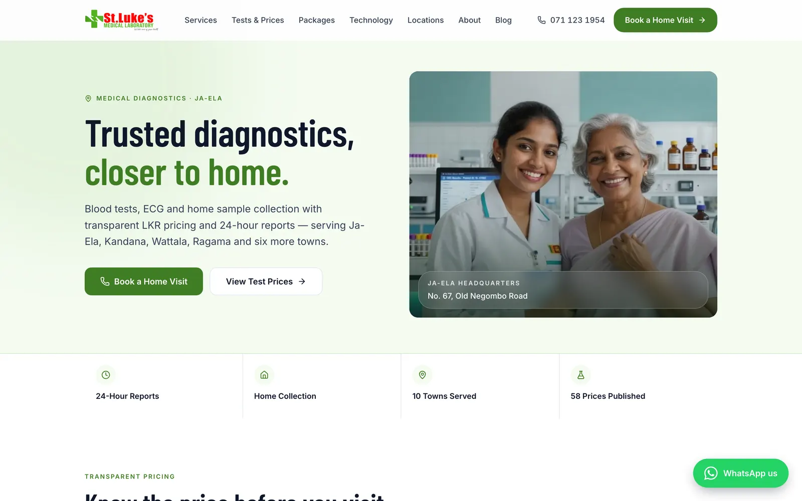
- 100/100
- 0.5s
- 63
- 0
- St Luke's Medical Laboratory
- Ja-Ela, Sri Lanka
- Design, build, SEO, content & management
- 20 Feb 2026 – ongoing
Design, build, SEO and ongoing management for an independent Ja-Ela diagnostic lab: 58 published test prices, 10 town pages, 20 MLT-reviewed articles and a 100/100 Lighthouse SEO score.
01 The challenge
An independent lab against the national chains.
St Luke's competes for the same patients as the big chains, with a smaller budget and a smaller brand. The website had to bring patients in from Google and WhatsApp, not just sit there as a brochure.
- 01
Smaller budget, same patients
The national chains outspend a single lab on ads and brand. St Luke's had to win on things they don't do, not on doing more of what they do.
- 02
Patients search by price and by place
People type “TSH test price” or “blood test Wattala”. A brochure site has no page that answers either, so the chains win by default.
- 03
Health searches demand proof
Google and patients both look for signs of clinical credibility before they trust a lab with a blood sample.
The strategy: three advantages the chains don’t use
02 Price transparency
Every price, published.
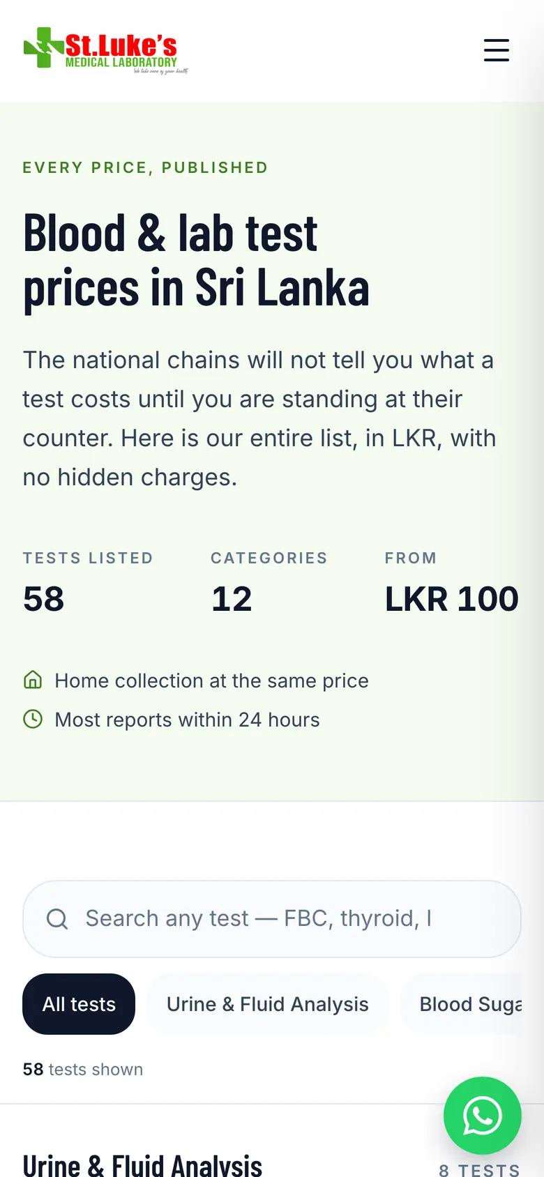
The national chains won’t tell you what a test costs until you’re at their counter. St Luke’s publishes the whole list in LKR. This is the real list, in a working copy of the finder we built. Try it.
- 58
- 12
- LKR 100
- LKR 7,000
58 tests shown
Urine Full Report (UFR)
Urine & FluidLKR400
Urine Microalbumin / UACR
Urine & FluidLKR1,400
Urine Sugar
Urine & FluidLKR100
Urine Albumin
Urine & FluidLKR100
Urine Sugar & Albumin
Urine & FluidLKR150
SFR + Sugar
Urine & FluidLKR400
Seminal Fluid Analysis (SFA)
Urine & FluidLKR500
Pregnancy Test (HCG)
Urine & FluidLKR250
Fasting Blood Sugar (FBS)
Blood SugarLKR280
Post Prandial Blood Sugar (PPBS)
Blood SugarLKR280
Random Blood Sugar (RBS)
Blood SugarLKR280
3 Point Sugar Profile
Blood SugarLKR850
Glucose Challenge Test (GCT) with FBS
Blood SugarLKR750
OGTT (1st hr, 2nd hr, FBS)
Blood SugarLKR1,300
OGTT (FBS, 2nd hr)
Blood SugarLKR1,000
HbA1C
Blood SugarLKR2,100
Full Blood Count (FBC)
HaematologyLKR400
WBC / DC
HaematologyLKR250
Platelet Count
HaematologyLKR400
Haemoglobin (Hb)
HaematologyLKR400
ESR
HaematologyLKR400
Blood Group
HaematologyLKR550
Malarial Parasites
HaematologyLKR250
Ferritin
HaematologyLKR2,400
Bleeding Time
CoagulationLKR300
Clotting Time
CoagulationLKR300
PT / INR
CoagulationLKR1,200
Serum Cholesterol
Lipids & CardiacLKR700
Lipid Profile
Lipids & CardiacLKR1,500
Serum Alkaline Phosphatase
LiverLKR700
Protein (Total, Albumin, Globulin)
LiverLKR1,200
Gamma GT (GGT)
LiverLKR700
SGOT (AST)
LiverLKR650
SGPT (ALT)
LiverLKR650
Serum Bilirubin (Total)
LiverLKR700
Serum Bilirubin (Direct / Indirect)
LiverLKR1,300
Liver Function Test (LFT)
LiverLKR2,250
Liver Profile
LiverLKR4,000
Blood Urea
KidneyLKR650
Serum Creatinine
KidneyLKR650
Serum Creatinine with GFR
KidneyLKR700
Serum Electrolytes
KidneyLKR1,350
Serum Uric Acid
KidneyLKR850
Calcium (Total)
KidneyLKR850
Ionized Calcium
KidneyLKR1,350
Renal Profile
KidneyLKR4,400
Renal Function Test (RFT)
KidneyLKR2,200
TSH
Thyroid & HormonesLKR1,800
Free T4 (FT4)
Thyroid & HormonesLKR1,900
Free T3 (FT3)
Thyroid & HormonesLKR1,900
C-Reactive Protein (CRP)
InflammationLKR900
Rheumatoid Factor (quantitative)
InflammationLKR1,000
HIV 1, 2
Infectious DiseaseLKR1,800
VDRL
Infectious DiseaseLKR1,000
HBs Ag
Infectious DiseaseLKR1,200
Dengue NS1 Ag
Infectious DiseaseLKR1,200
Vitamin D
VitaminsLKR7,000
Full Body Tests
PanelsLKR4,300
Four packages, four different questions.
Bundles are named for the worry that brings someone in, not for the lab’s internal panels. Pick one to see exactly what it includes.
Full Body · 9 tests included
- Full Blood Count (FBC)included
- ESRincluded
- Fasting Blood Sugar (FBS)included
- Urine Full Report (UFR)included
- Lipid Profileincluded
- SGOTincluded
- SGPTincluded
- Serum Creatinineincluded
- Blood Ureaincluded
- C-Reactive Protein (CRP)not included
- Rheumatoid (RA) Factornot included
- TSHnot included
- Serum Electrolytesnot included
- Ionized Calciumnot included
- Serum Creatinine with GFRnot included
- Serum Uric Acidnot included
- Urine Microalbumin (UACR)not included
03 Hyper-local SEO
Ten towns. Ten real pages.
Seven walk-in towns and three home-visit areas along the Negombo Road corridor. Each page is written for its town, not copied and pasted. Pick a town on the map.
- Ja-Ela HQ
- 6 more walk-in towns
- 3 home-visit areas
Home visits only
Katunayake
“Home and workplace blood tests for airport staff, Free Trade Zone workers and pre-employment medicals.”
stlukesmedilab.com/locations/katunayake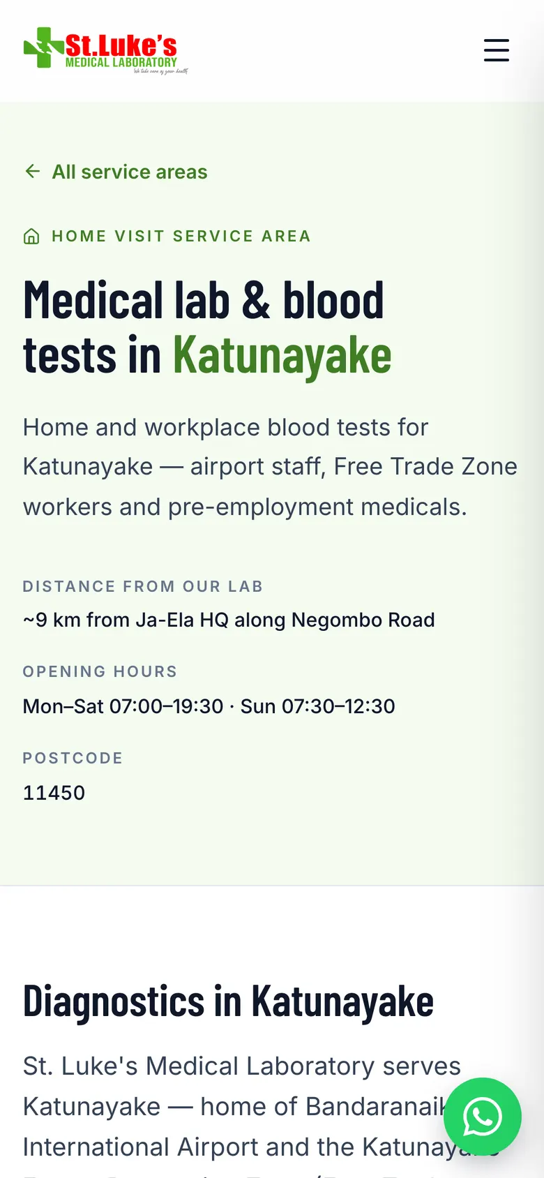
Every town page carries
- Its own introduction, written for that town
- Local landmarks and neighbourhoods
- 2–3 FAQs local patients actually ask
- Opening hours, distance from the lab and postcode
- Google Maps embed linked to the Business Profile
- MedicalBusiness and City structured data
04 Technical SEO
A page for every search.
63 pages in the sitemap, each built around something a patient actually types. One keyword-focused H1 per page, canonical URLs and an auto-generated 1200×630 share image for each.
A patient searches
The page that answers it
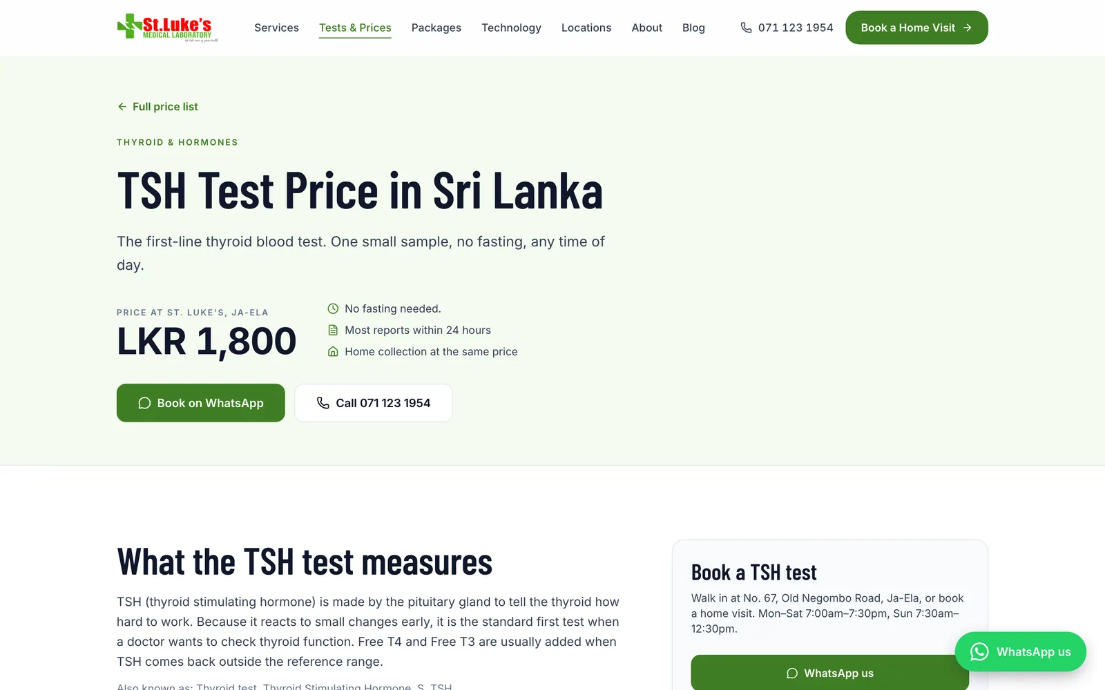
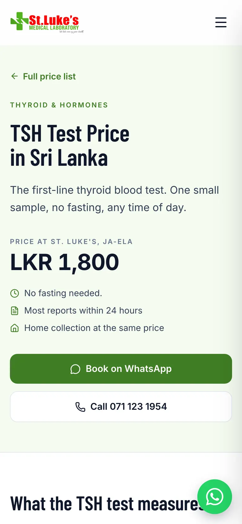
stlukesmedilab.com/price-list/tsh
One of 19 test-price pages. The price, fasting rules and a WhatsApp button sit above the fold, with MedicalTest, Offer and FAQPage markup underneath.
stlukesmedilab.com/price-list/tsh
Equipment, not adjectives.
Instead of calling itself “world-class”, the lab names and pictures all four analyzers. Each is marked up as a MedicalDevice, which tells search engines the lab does its own clinical testing.
MedicalDevice · 01
CLIA Immunoassay Analyzer
Thyroid, fertility hormones, Vitamin D, B12, tumour markers
MedicalDevice · 02
BioSystems A15
Liver, kidney, cholesterol and blood-sugar biochemistry
MedicalDevice · 03
Audicom AC9801
Sodium, potassium and chloride electrolytes
MedicalDevice · 04
Medonic Hematology Analyzer
Full blood count, platelets and dengue monitoring
05 Structured data
22 schema types, read by machines.
Patients see the page. Google, Maps and AI assistants read the structured data underneath. Pick a template to see what it tells them, counted from the live HTML.
<script type="application/ld+json"> · /price-list
- "@type": "MedicalTest"×66
- "@type": "Offer"×58
- "@type": "City"×10
- "@type": "MedicalDevice"×4
- "@type": "FAQPage"×1
- "@type": "OfferCatalog"×1
- "@type": "MedicalBusiness"×1
- "@type": "BreadcrumbList"×1
- "@type": "WebSite"×1
- "@type": "SearchAction"×1
All 22 types across the site
- MedicalBusiness
- MedicalTest
- MedicalDevice
- MedicalWebPage
- MedicalProcedure
- FAQPage
- Question
- Answer
- Offer
- OfferCatalog
- BreadcrumbList
- ListItem
- ItemList
- City
- PostalAddress
- OpeningHoursSpecification
- WebSite
- SearchAction
- EntryPoint
- SiteNavigationElement
- Person
- AboutPage
Highlighted: the types on the price list. Each template carries what Google needs for that kind of page, from prices as Offer to the reviewer as Person.
06 Content marketing
Health articles, reviewed by a lab technologist.
Every article is reviewed by a qualified medical lab technologist (MLT), named in the byline, and structured so Google and AI tools like ChatGPT, Gemini and Perplexity can quote it.
- 20
- ≈21,400
- 17 / 3
- All
June 2026 · dengue spike
Published while people were searching.
When dengue cases jumped in the Western Province, the dengue articles went live in English and Sinhala on the same day, 7 June. A follow-up listing the official high-risk areas went live on 26 June.
…/dengue-spike-2026-ja-ela-wattala
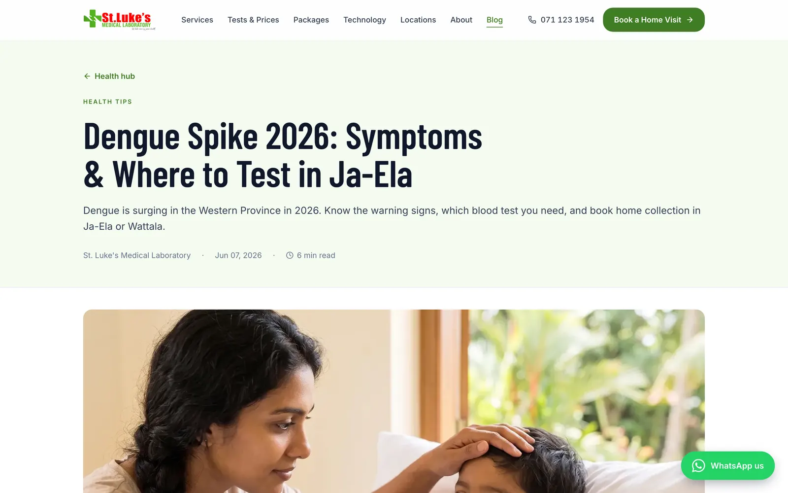
English
…/dengue-spike-2026-ja-ela-wattala-si
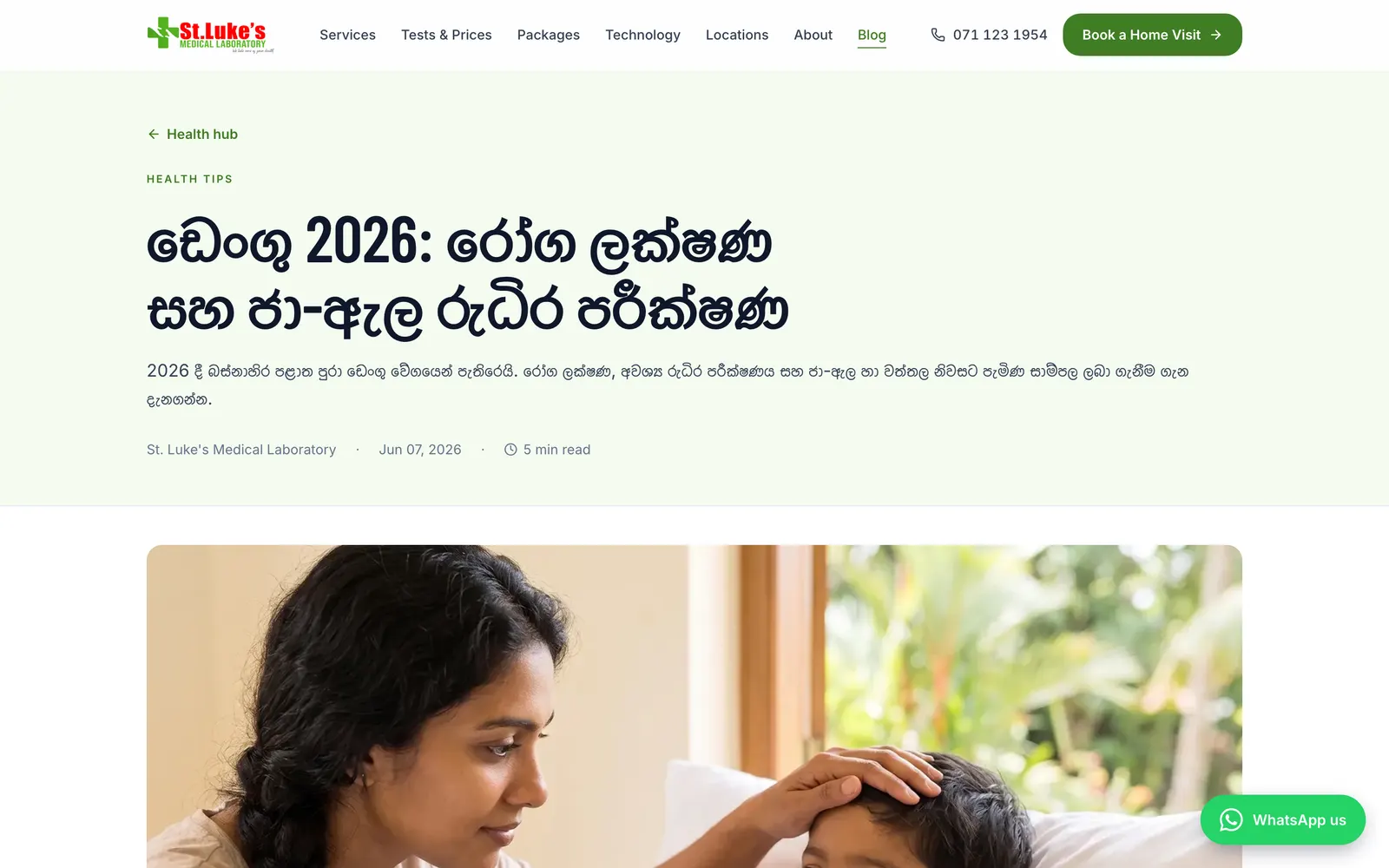
සිංහල
20 of 20 articles
- Chikungunya in Ja-Ela & Wattala: symptoms, blood tests and how to tell it apart from dengueOutbreak alerts30 Aug
- Leptospirosis (rat fever) in Gampaha: who’s at risk after the rainsOutbreak alerts28 Aug
- HbA1c test in Ja-Ela: catching prediabetes before it becomes diabetesTests explained26 Aug
- Thyroid test (TSH) in Ja-Ela: when tiredness or weight change is worth testingTests explained24 Aug
- Fatty liver without alcohol: why it’s rising in Sri LankaTests explained22 Aug
- Home blood tests in Negombo & Seeduwa: how it works and what it costsLocal services23 Jul
- Pre-employment & visa medical blood tests in KatunayakeLocal services23 Jul
- Biochemistry blood tests on the BioSystems A15Inside the lab11 Jul
- CLIA immunoassay testing: thyroid, Vitamin D & ferritinInside the lab11 Jul
- Electrolyte testing on the Audicom AC9801Inside the lab11 Jul
- Full blood count & dengue monitoring on the Medonic analyzerInside the lab11 Jul
- Vitamin D රුධිර පරීක්ෂණය ජා-ඇලේTests explainedSI5 Jul
- Vitamin D test in Ja-Ela: why deficiency is commonTests explained5 Jul
- ඩෙංගු අවදානම් කලාප — 2026 ජූනිOutbreak alertsSI26 Jun
- Dengue high-risk areas in Ja-Ela, Wattala & Ragama: official June 2026 listOutbreak alerts26 Jun
- ඩෙංගු 2026: රෝග ලක්ෂණ සහ ජා-ඇල රුධිර පරීක්ෂණOutbreak alertsSI7 Jun
- Dengue spike 2026: symptoms & where to test in Ja-ElaOutbreak alerts7 Jun
- Understanding your fasting blood sugar resultsTests explained15 Feb
- Why regular lipid profiling is crucialTests explained10 Feb
- Preparing for your first ECG: what to expectTests explained5 Feb
07 Experience
Five ways to get in touch, one tap away.
Built mobile-first to WCAG 2.2 AA, with 44 px minimum tap targets. Most patients arrive on a phone, so getting in touch is never more than a thumb away.
- 01
Click-to-call
The phone number is a tap target in the header, hero and footer.
- 02
WhatsApp
A floating button on every page and a “Book on WhatsApp” button on every test page.
- 03
AI chat assistant
An assistant on the site for quick questions about tests and visits.
- 04
Sticky mobile bar
Call and WhatsApp stay within thumb reach while scrolling.
- 05
Home-visit booking
Book a phlebotomist to the door in any of the 10 towns.

08 Performance
Fast, stable and lighter than before.
In September we rebuilt the design system and replaced a heavy animation library with CSS-only animation. The site got lighter and the scores went to the top.
100
100
97
100
Before1.4 MB
After0.9 MB
36% less JavaScript
- 0.5 s
- 0
- ≈7,600
- 28
09 The live site
Scroll it yourself.
Full-length captures of stlukesmedilab.com, taken in October 2026.
stlukesmedilab.com
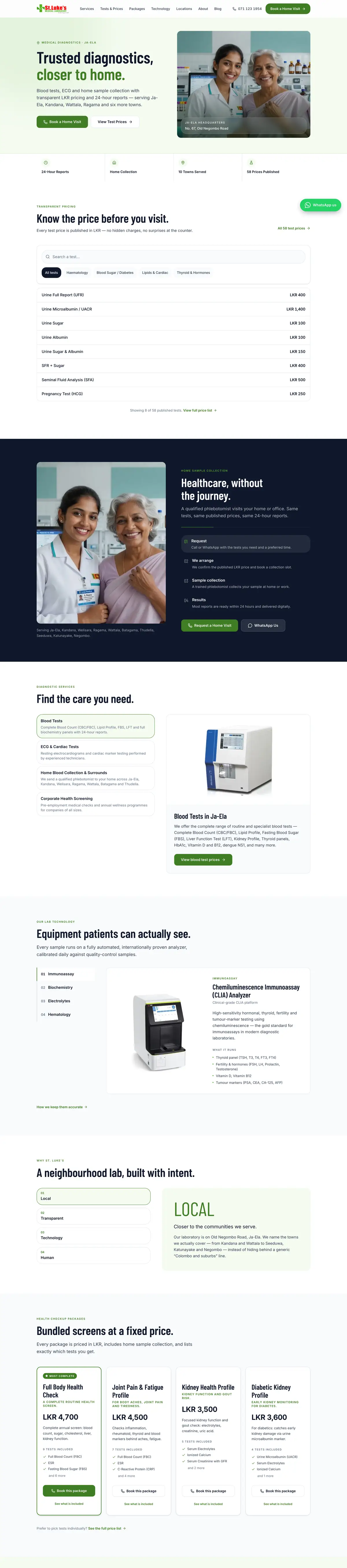
Scroll inside the window
10 Eight months
Shipped every month, still going.
44 commits and 18 feature launches since February. New articles, towns or services go live by editing one file, with no CMS fees.
Feb2026
- Project kickoff
- New brand profile
Apr2026
- Hero and price-list redesign
May2026
- Full SEO playbook
- Structured data
- Blog engine
Jun2026
- Google Search Console
- AI chatbot
- Dengue articles in English and Sinhala
- Mobile speed work
Jul2026
- 3 new service-area towns
- Google Maps embeds
- MLT-reviewed articles
Aug2026
- 5 articles optimised for AI search
Sep2026
- Design-system rebuild
- 36% less JavaScript
Oct2026
- 19 test-price landing pages
- Floating WhatsApp button
- Next.js 16
- React 19
- TypeScript
- Tailwind CSS 4
- Vercel
- Schema.org
For clinics and labs
How a small lab competes with the chains on Google
A national chain will always outspend you on ads. It is much harder for a chain to be as open, as local and as technically careful as one focused lab. Published prices answer the question patients actually have. Town pages meet them where they live. Structured data and reviewed articles show Google the lab is genuine.
That is how we build healthcare websites in Sri Lanka: design, development and SEO as one job, managed month after month.
Questions
About this project
Where is St Luke's Medical Laboratory located?
St Luke's Medical Laboratory is an independent diagnostic lab headquartered in Ja-Ela, Sri Lanka. It serves 7 walk-in towns and 3 home-visit service areas: Ja-Ela, Kandana, Welisara, Ragama, Wattala, Batagama, Thudella, Seeduwa, Katunayake and Negombo.
Does St Luke's publish its lab test prices?
Yes. The site publishes 58 test prices in LKR across 12 categories, from LKR 100 to LKR 7,000, in a searchable price finder with a preparation guide for each test. It also lists 4 bundled health packages.
What did Uniix Studio do for St Luke's?
Uniix Studio designed and built the St Luke's website and runs its SEO, content and ongoing management. That includes the price finder, 10 town landing pages, 19 test-price landing pages, 22 schema.org types of structured data, 20 MLT-reviewed health articles and the WhatsApp, call, AI chat and home-visit booking flows.
How fast is the St Luke's website?
The site scores 100/100 for Lighthouse SEO on mobile and desktop, 100/100 for Best Practices, 97/100 for Accessibility and 100/100 for desktop performance. It loads in 0.5 seconds on desktop with zero layout shift.
What technology is the St Luke's website built with?
It is built with Next.js 16, React 19, TypeScript and Tailwind CSS 4, and hosted on Vercel. New articles, towns or services are added by editing a single file, so there are no CMS fees.
Are the health articles reviewed by medical professionals?
Yes. Every article is reviewed by a qualified medical lab technologist (MLT), who is named in the byline. 3 of the 20 articles are also available in Sinhala.
Closing
Can patients find your prices?
Uniix Studio designs, builds and runs websites for clinics and labs in Sri Lanka, so independent practices can win searches the big chains take for granted.
Let’s build yours.
Continue Exploring