Loading…
All work
Brand identity case study ·2026
Brand Identity / Logo Design
Cinecraft Media · Logo & brand identityCrafting a cinematic identity.
An exploration of form, contrast, and typographic precision — bringing Cinecraft Media’s visual identity together through a distinctive CM monogram.
- Client
- Cinecraft Media
- Services
- Logo Design, Brand Identity
- Agency
- Uniix Studio
01 The project
A mark designed to make an impression.
Cinecraft Media’s identity centres on a bold, interlocking CM monogram paired with a clean typographic wordmark. The design brings together distinctive letterforms, a restrained monochrome palette, and a subtle gold accent to create a recognisable and versatile visual signature.
About the client
Cinecraft Media is a creative video production studio in Colombo, Sri Lanka, bringing brand stories to life, from social reels to full-scale productions. Its own line: “Crafting visuals that speak louder.”
- What they make
- Social media content
- Corporate productions
- Hospitality & tourism films
- Event coverage
- Aerial & FPV videography
- Product photography
- Architecture photography
- How they work
- Pre-production → Production → Post-production & delivery
- Recent work shown
- Amari Colombo · Street Burger · The Coast
Source: Cinecraft Media’s website and social channels.
What we delivered
- Full logoMonogram, CINECRAFT wordmark and MEDIA line
- Standalone monogramThe interlocking mark on its own
- Light & dark versionsBlack artwork for light grounds, white for dark
- Vector mastersFour SVG files, one per version
- Raster exportsTransparent PNGs and 2320 px JPG presentations
02 The logo concept
One monogram. A distinctive identity.
Three notes on how the mark works. These are our design reading of the finished artwork.
- 01
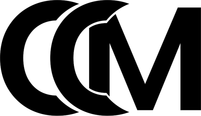
The CM monogram
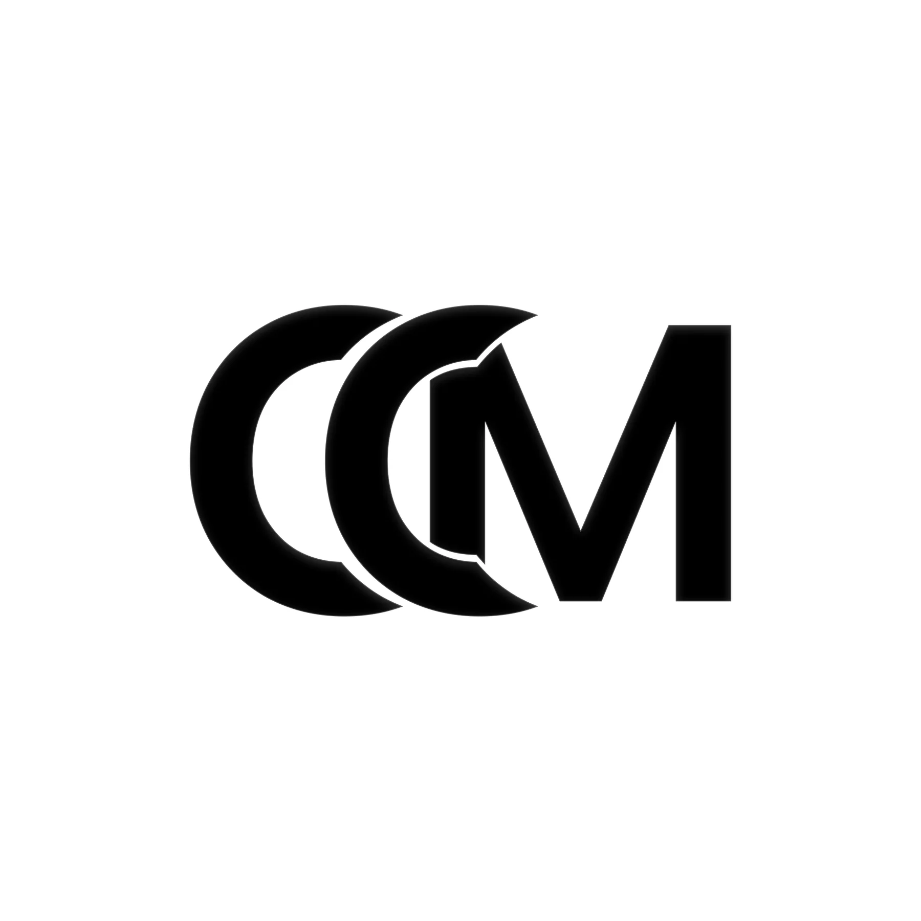
Two C forms and an M interlock into one compact symbol. Where one letter passes behind the next it is cut back along the curve in front, leaving a fine channel instead of a merged blob. The result reads as layers: three shapes stacked in depth, not three letters in a row.
- 02
Contrast & structure
Heavy strokes sit against open counters. The round Cs meet the straight stems and sharp diagonals of the M, so curve and angle are always next to each other. That push and pull keeps the mark strong at a glance and gives it a clear silhouette at any size.
- 03
A cinematic character
Pure black, pure white and one restrained warm accent. Set on deep black, the mark behaves like a title card: it has light and shadow, not colour, to work with. For a studio whose work is hotel films, brand reels and aerial footage, a mark that behaves like an end card does more than a brighter palette would.
03 Logo anatomy & form
Read straight from the vector master.
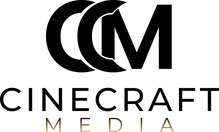
The identity pairs a strong, overlapping monogram with a restrained wordmark. The contrast between the compact symbol and the spacious typography creates a clear hierarchy while allowing the complete logo to function as a unified signature.
One signature, three tiers
Monogram, wordmark and descriptor stack into a single lock-up. The monogram carries the identity; the type says who it belongs to.
Measurements in source units · 752 × 453 vector master
2
identical C forms
The two Cs are the same outline, repeated 107.8 units to the right. One shape, used twice.
1.74
width-to-height ratio
The monogram measures 431.7 × 248.4 units. The standalone icon file keeps the same proportion.
3.1×
monogram to cap height
The monogram stands about three times the height of the CINECRAFT capitals beneath it.
0.15
units of drift
MEDIA starts where the monogram starts: their left edges sit 0.15 units apart on a 752-unit canvas.
04 Typography & hierarchy
Precision in every letter.
The wordmark balances the strength of the monogram with a more restrained typographic treatment. The widely spaced lettering introduces clarity and rhythm, while the smaller MEDIA line creates a secondary level of information.
Relative height of each tier, in source units
- Monogram248.4
Bold, geometric, interlocking
- CINECRAFT80.7
Uppercase, open letter spacing
- MEDIA48.4
Smaller, widely tracked, gold gradient
The wordmark is supplied as vector outlines, so the artwork above is the logo itself, not a font set to look like it.
05 Colour & contrast
An identity built on contrast.
Black & white
The mark is drawn in pure black or pure white, nothing in between. That gives it the highest contrast either ground can offer, keeps it legible when it is reproduced small or in one colour, and lets the same shapes work on screen, on print and over video.
Champagne gold
Gold appears in one place only: the MEDIA line, as a gradient that is warmest at the baseline and fades into the logo colour above. It adds warmth and a sense of occasion without competing with the monogram, and the restraint is what makes it noticeable.
Black
#000000
Fill of the light-background artwork (Vector-1.svg, Vector-3.svg)
White
#FFFFFF
Fill of the dark-background artwork (Vector.svg, Vector-2.svg)
Gold
#F7DE91
Gradient stop at the MEDIA baseline, fading to the logo colour at the cap line
Presentation black
≈ #0E0E0E
Background of the satin presentation JPGs (sampled, approximate)
Values sampled from the supplied files. They describe the artwork; they are not a published colour specification.
Try it on a surface
Pick a background and the matching supplied artwork is swapped in. The contrast ratio is calculated live against the logo colour.
- Surface
- Deep black #080808
- Contrast ratio
- Contrast 20.0:1
- Artwork used
- Artwork Vector.svg · white full logo
06 Logo variations
Designed for different contexts.
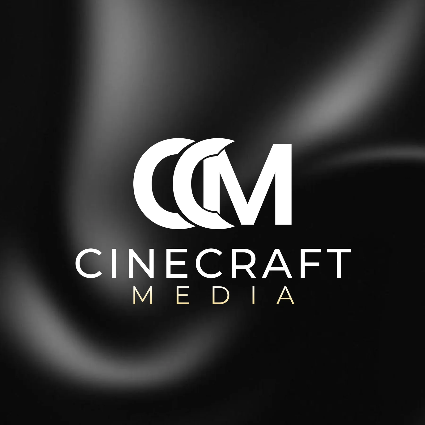
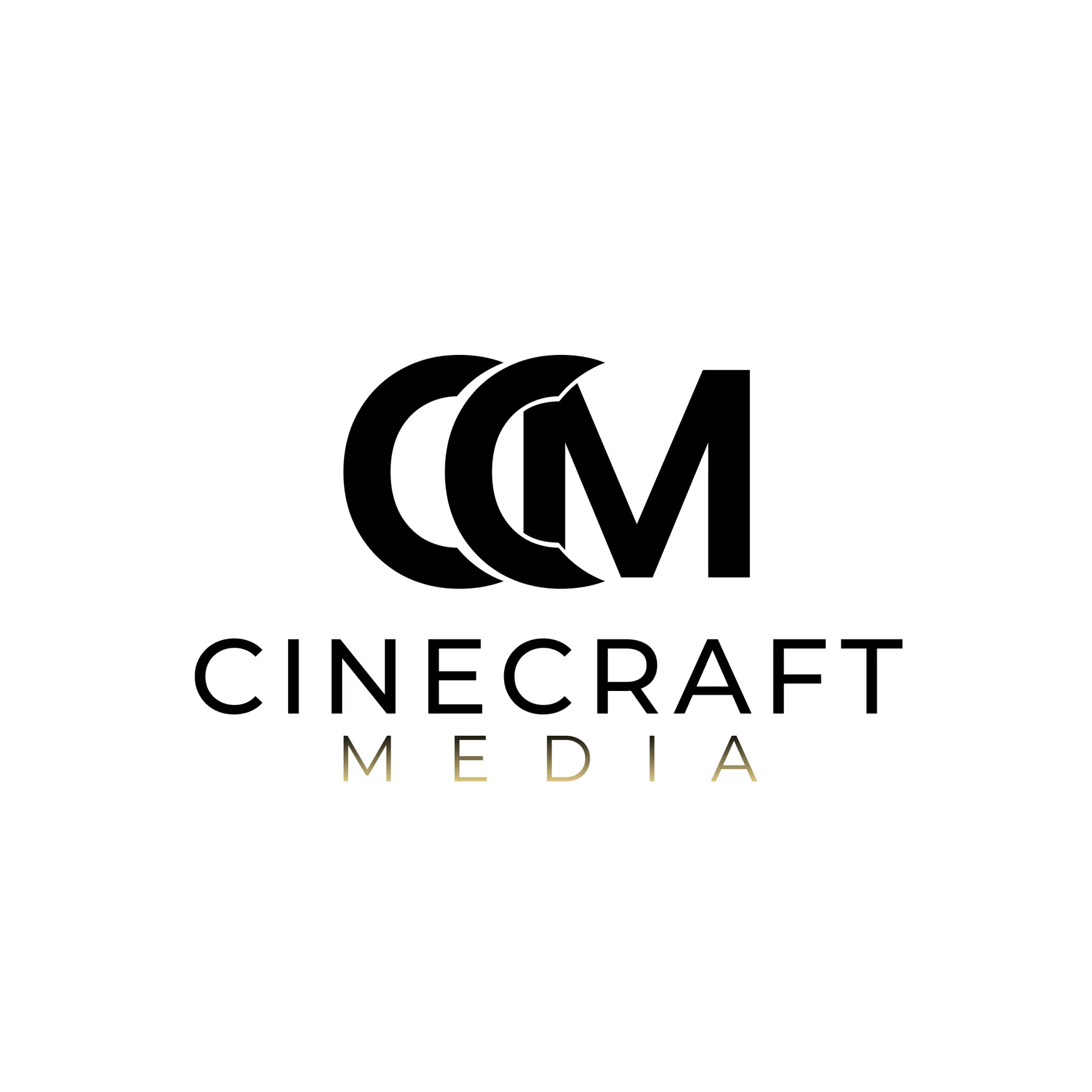
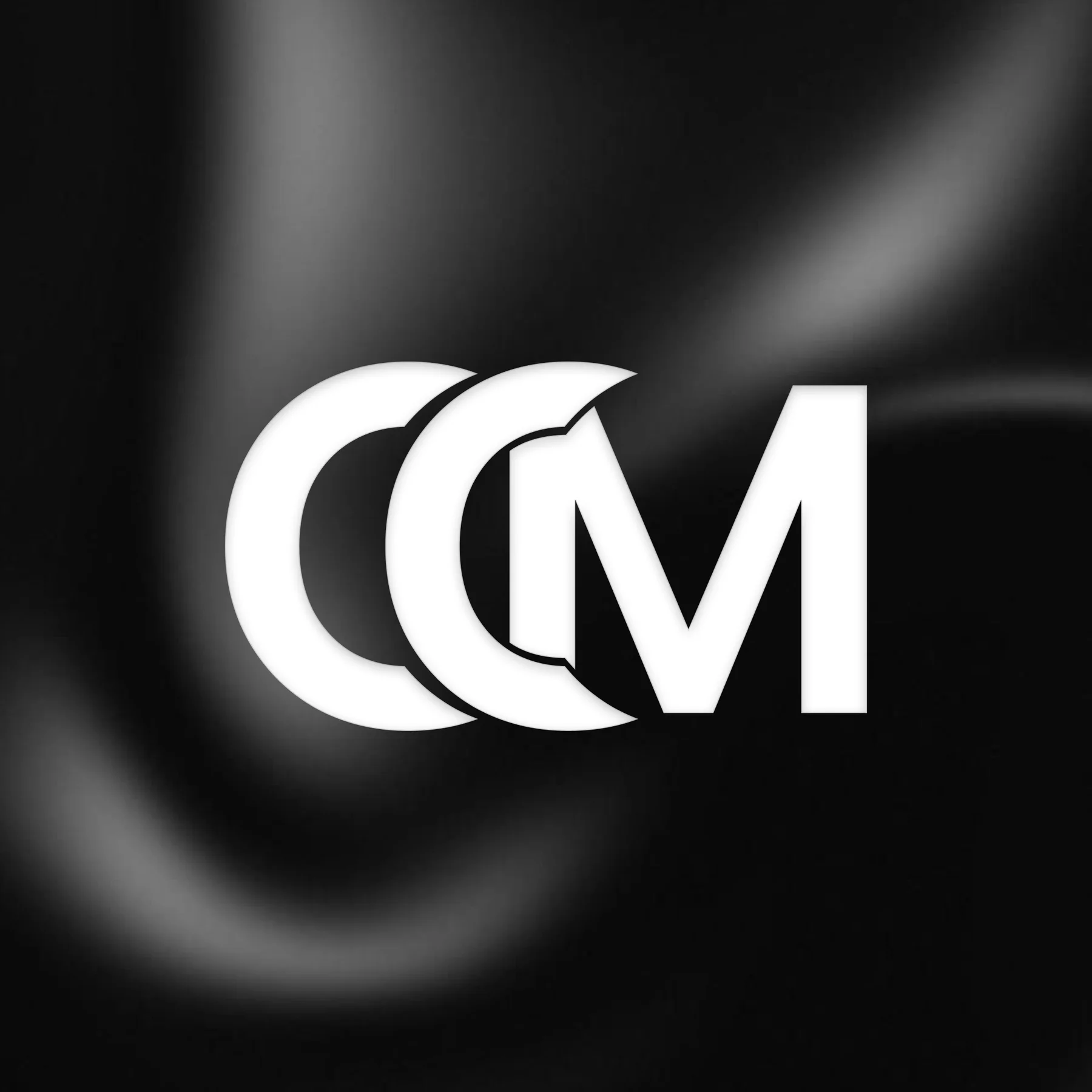
The four presentation files supplied with the identity: full logo and monogram, each on a dark and a light ground.
Primary identity
Standalone symbol
At every size
- 16px
- 24px
- 32px
- 48px
- 72px
- 120px
- 16px
- 24px
- 32px
- 48px
- 72px
- 120px
The Cinecraft Media monogram shown at 16, 24, 32, 48, 72 and 120 pixels tall on dark and light backgrounds.
07 In context
Imagined on set and in the studio.
Illustrative concepts showing how the identity could work in a production studio’s world. These are visualisations, not applications produced or installed for the client.
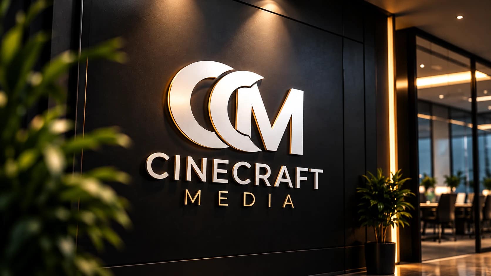 Concept mockup
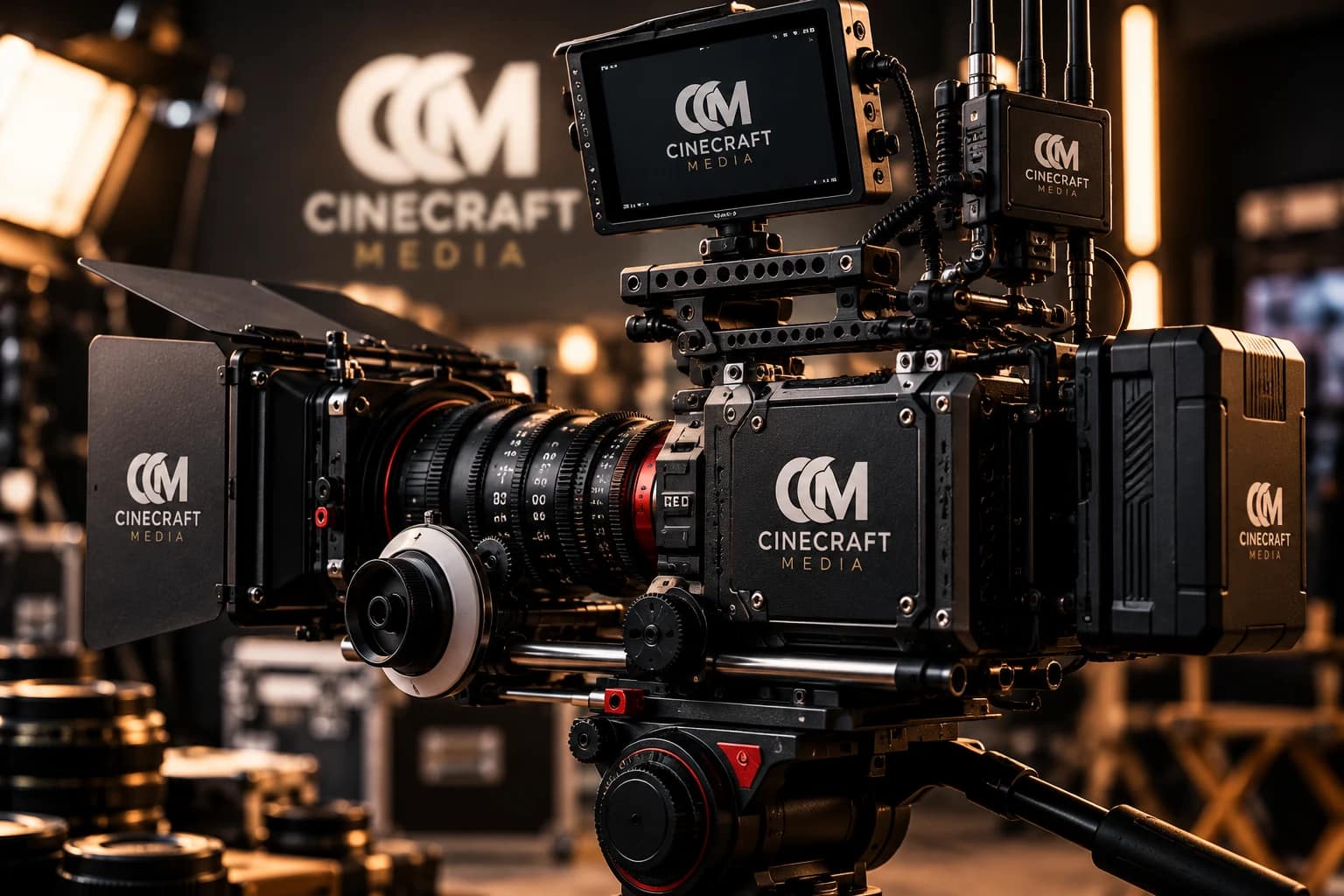 Concept mockup
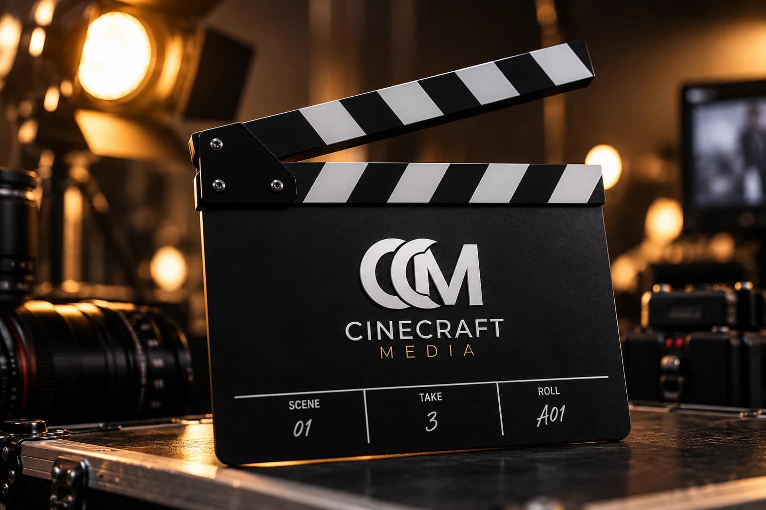 Concept mockup
Strong in its simplest form.
08 Design approach
From visual exploration to a unified mark.
An editorial reading of the finished identity, in three stages. It describes what the design does, not a dated production log.
01
Exploration
Bring the initials together into one overlapping monogram, and pair it with a wordmark that names the business in full.
02
Refinement
Balance the letterforms against their counters, cut each overlap cleanly, and set the type so it supports the mark instead of competing with it.
03
Identity presentation
Resolve light and dark versions of the full logo and the monogram, so the identity holds its contrast on any background.
A clear mark. A considered identity.
Cinecraft Media — brand identity by Uniix Studio
For video production studios
What makes a strong logo for a video production company
A production studio’s logo rarely sits on a plain page. It appears as a watermark over footage, on the end card of a hotel film, in the corner of a reel and as a tiny Instagram or TikTok avatar. It needs a compact symbol that survives at small sizes, a full lock-up for credits and proposals, and dependable light and dark versions.
That is why we design a logo as a small system rather than a single file, and why the Cinecraft Media identity ships as a full logo and a monogram, each in black and in white, as vectors and as raster exports. It is the foundation of a wider brand identity.
Questions
About the Cinecraft Media identity
Who designed the Cinecraft Media logo?
Uniix Studio, a creative design studio in Colombo, Sri Lanka, designed the Cinecraft Media logo and brand identity: an interlocking CM monogram, a letter-spaced CINECRAFT wordmark and a MEDIA line in a gold gradient, with versions for light and dark backgrounds.
What is Cinecraft Media?
Cinecraft Media is a creative video production studio in Colombo, Sri Lanka. It produces brand films, social media reels, corporate productions, hospitality and tourism films, event coverage, aerial and FPV videography, and product and architecture photography, handling projects from pre-production through to delivery.
What is the Cinecraft Media logo made of?
The logo has three tiers. On top is a monogram of two identical C forms and an M that overlap and interlock. Below it sits the CINECRAFT wordmark in widely spaced capitals, and below that a smaller MEDIA line that starts at the same left edge as the monogram and spans almost exactly its width.
What colours are used in the Cinecraft Media logo?
The mark is pure black (#000000) on light backgrounds and pure white (#FFFFFF) on dark ones. The only accent is the MEDIA line, which uses a gradient from a warm gold (#F7DE91) at the baseline to the logo colour at the top. These values are sampled from the supplied vector files.
Which logo versions were delivered for Cinecraft Media?
Four versions: the full logo and the standalone CM monogram, each for light and for dark backgrounds. Each was supplied as an SVG vector master, a transparent PNG and a JPG presentation file.
Why does a video production company need a monogram as well as a full logo?
A video production studio's brand often appears in small or busy places: social avatars, video watermarks, the corner of a frame or a favicon. A compact monogram stays recognisable where a full wordmark would be too small to read, while the full logo is used where there is room, such as title cards, covers and credits.
Does Uniix Studio design logos and brand identities?
Yes. Uniix Studio designs logos, monograms and complete brand identities for businesses in Sri Lanka, Australia and the UK, delivered as vector masters with light and dark versions ready for print, web, social and video.
Explore more of our work.
Discover how Uniix Studio brings brands to life through thoughtful design and creative execution.
Continue Exploring